Using Tonal Color in your Paintings
I’m currently putting the finishing touches on a digital class on how to mix colors and thought I’d share some thoughts on how adding tonal colors to a painting enhances its color richness and complexity.
What is tonal color?
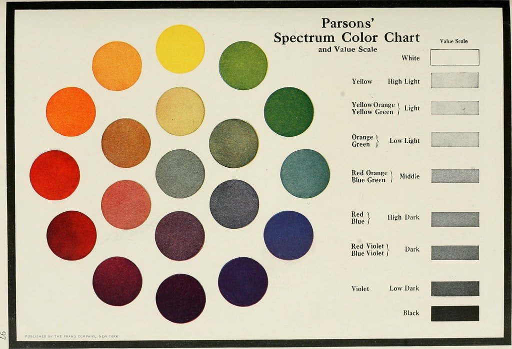
While saturated hues sit at the outer circle of a color wheel, tonal colors sit at or near the center of the color wheel. You can see examples of this in the beautiful, vintage color studies below, found at Public Domain Review. Notice that the hues at the center of the color wheel have less color intensity. This is because they are created by mixing complementary colors which neutralize each other when they are mixed together. Interestingly, when complements are placed beside one another, rather than mixed, the opposite happens and they create a very intense color scheme; the red/green combo we see during the holidays, for instance.

Why use tonal color in a painting?
You might be wondering why you should use tonal color, especially if your goal is to achieve a vibrant, vivid look in a painting.
Claude Monet is, of course, known for his luminous use of color. I make a beeline for his paintings when I visit museum collections that house them and am always mesmerized by the intensity and beauty of the color.

Claude, Monet, Waterloo Bridge, London, at Sunset, 1904 , National Gallery of Art
His color brilliance is not only due to his use of the impressionist technique, but also depends on his hue choices, which often include tonal colors that serve as a sort of foil for the more highly saturated hues.
In the example above we see tonal grays in the smokestacks, on the underside of the bridge, in the water and clouds. These grays make the pinks, yellows, and lavenders all the more brilliant and intense. They provide places of visual rest and subtle notes of complimentary color.
Let’s look at another example.
I took this photo of one of Leonardo da Vinci’s most famous paintings on a visit to the Louvre. The earth tones in the foreground, as well as the grays in some of the clothing, create space for that gorgeous blue to really pop. Imagine if the other colors in the painting were equally saturated. They would visually compete with the blue so it wouldn’t stand out as distinctly.
The appearance of a color is relative to the colors adjacent to it. In this painting, the tonal colors are like back up singers, helping the star of the show (the vivid blue) to shine.
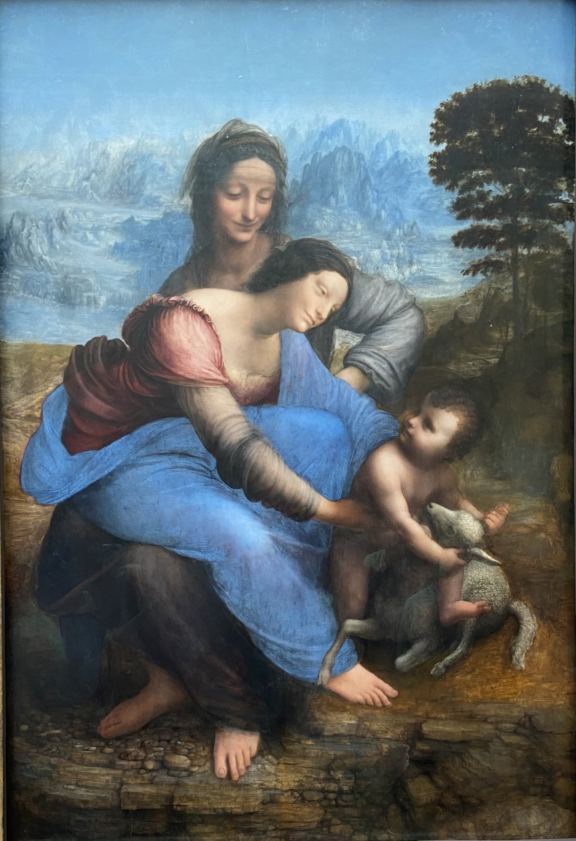
Lenordo da Vinci, The Virgin and Child with Saint Anne, Musee du Louvre